

Choosing Paint Colors That Complement Natural Brick or Stone
[BANNER]
Brick and stone bring character to a home before a paint can ever enters the picture. Their color shifts in sunlight, their texture creates natural contrast, and every section can carry slightly different tones.
That makes choosing paint colors that work with natural brick or stone a matter of working with what your home already gives you. A palette can make masonry feel connected to the painted parts of the exterior.
Start With the Colors Already in the Masonry
Natural brick rarely reads as one flat red. One section may show rusty orange while another leans brown or muted burgundy. Stone can carry warm beige or smoky gray, with other undertones appearing across the surface.
Look at the masonry from several feet away rather than focusing on one brick or stone. The overall impression matters more than a single fleck of color.
Your paint color should relate to that larger visual read. When the siding or trim shares an undertone with the masonry, the exterior feels connected without looking overly matched.
Let Undertones Guide the Palette
Undertones can change how two colors behave next to each other. A gray with a cool blue base may look crisp on a paint chip, yet it can feel harsh beside brick with strong orange warmth.
Warm masonry often works well with beige, taupe, warm white, or muted olive influences. Cooler stone may pair more naturally with blue-gray, charcoal, or a cleaner white.
You don’t need to copy a masonry color. Aim for a paint shade that speaks the same color language. That small connection helps the painted surfaces sit comfortably beside permanent materials.
Quick Tip: Find the Quietest Color
When brick or stone has a lot of variation, look for one of its quieter background shades rather than its most noticeable color. Use that subtle undertone as a reference while comparing paint samples. It can help you create a connection without making the exterior look overly coordinated.
Decide Where You Want Contrast
Some homes look best with gentle transitions between masonry and paint. Others benefit from stronger contrast around trim or the front door.
Start by deciding which material should hold the most visual attention. If the brick has rich variation and attractive detail, quieter paint can let it stand out. If the stone reads neutral from the street, a deeper siding color may bring more definition to the exterior.
Contrast works best when it has a purpose. Too many competing light and dark areas can make a facade feel visually busy.
Compare Paint Against the Mortar
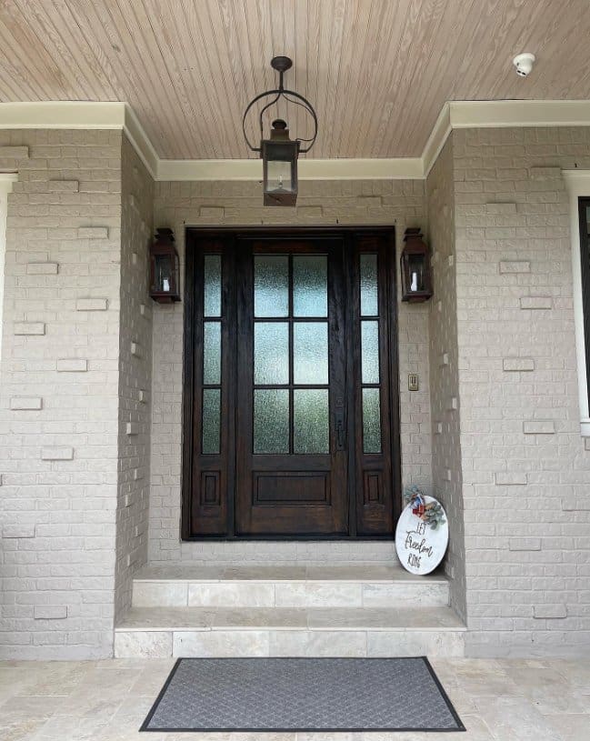
Homeowners often focus on brick or stone and overlook mortar, yet mortar can occupy a large amount of visible surface. Its color can change how the masonry reads as a whole.
Creamy mortar may support warmer whites and softer neutrals. Gray mortar can create an easy bridge to cooler siding or trim.
Take a paint sample outside and hold it near the masonry, followed by the mortar. You may notice that a color you liked on its own suddenly feels too cool or too warm. Comparing the surfaces separately gives you a clearer view of how the palette will work across the home.
Test Colors in Real Exterior Light
Exterior light changes paint throughout the day. A warm white can look creamy in morning shade and much brighter under direct afternoon sun.
Sample boards give you a better reference than a small chip. Paint a large movable board and place it beside the brick or stone on different sides of the house. You can see how the color responds without painting several test patches directly onto the exterior.
Check the sample in morning light and again later in the day. Look at it from the street as well. A shade that feels balanced up close may read very differently from farther away.
A Simple Sample Check
Before you settle on a color, ask a few focused questions:
- Does the paint share a warm or cool direction with the masonry?
- Does the contrast feel comfortable from the curb?
- Does the shade still work when the light changes?
- Does it coordinate with the roof and other permanent finishes?
A color doesn’t have to look identical under every condition. You’re looking for one that still feels at home beside the masonry as the exterior light shifts.
Work With the Roof and Other Fixed Features
Brick or stone may be the first fixed material you notice, yet the roof can carry just as much visual weight. Roof shingles often contain subtle tones that influence which paint colors feel natural on the home.
A warm brown roof may support an earthy neutral or creamy white beside brick. Charcoal roofing can sit comfortably with cooler stone and deeper siding shades.
Step back far enough to see the roof and masonry in the same view when you compare samples. Existing windows or metal finishes may enter that view as well. A shared undertone can help these permanent features feel related without making every surface match.
Use Trim to Create a Clean Transition
Trim often acts as the visual bridge between masonry and siding. The right trim color can soften contrast or bring more definition to architectural details, depending on the look you want.
Bright white can feel stark beside weathered brick or warm stone. A softer white may create a smoother transition while still outlining windows and rooflines.
Deeper trim can work beautifully on homes with lighter stone. The contrast frames the architecture without asking the siding color to carry all the visual interest.
Give the Front Door Its Own Role
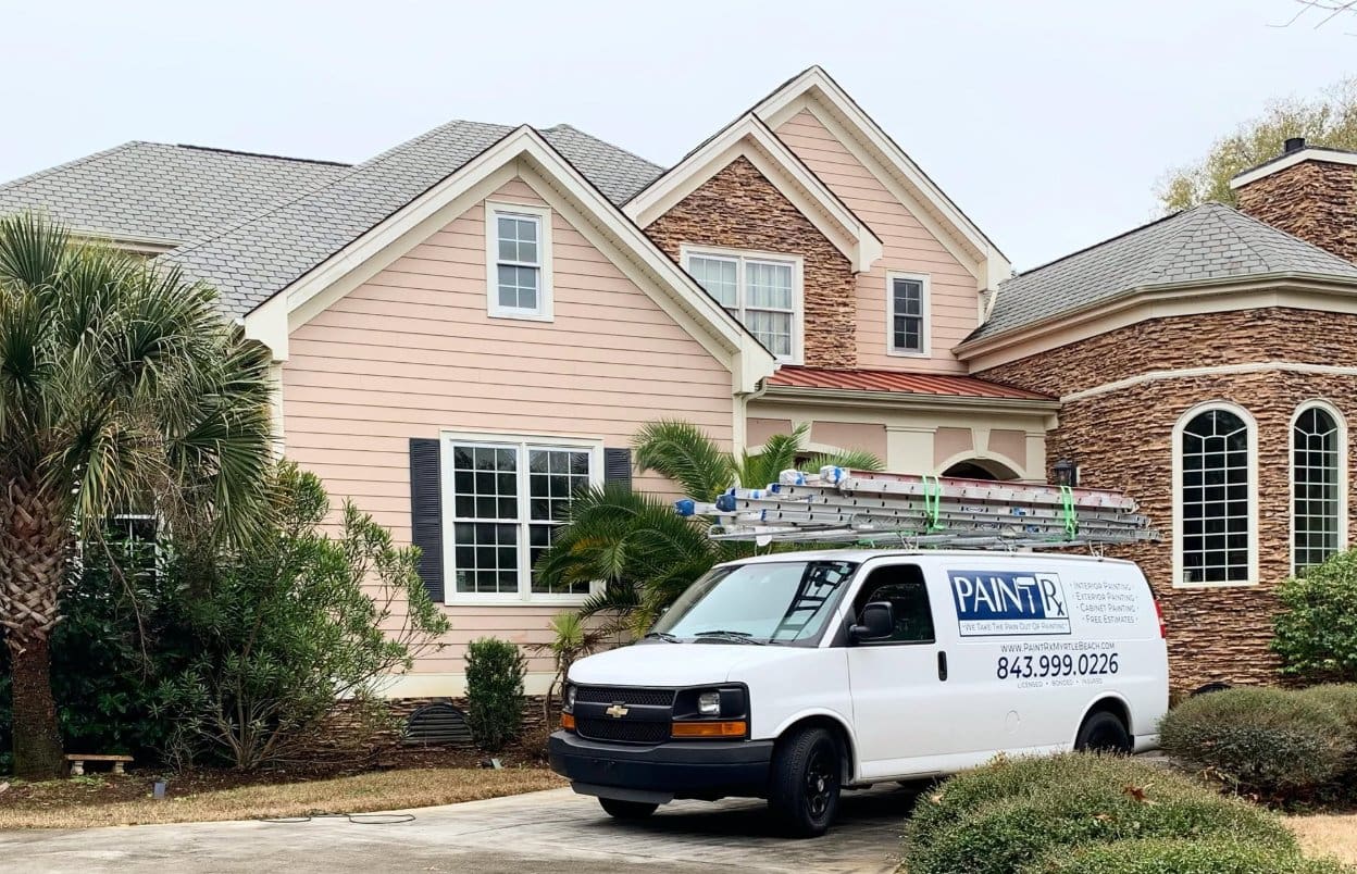
The front door gives you more freedom because it occupies a smaller area. You can pull a subtle tone from the brick or stone and use a stronger version of it for the door.
Deep green can connect with earthy stone, while a muted blue may suit cooler gray masonry. Rich brown can echo the warmth in traditional brick without disappearing against it.
Stand at the curb when you evaluate a door color. From that distance, you can see how much attention it attracts and whether it feels connected to the rest of the home.
Know When Professional Color Guidance Helps
Exterior paint covers a large visual area, and the existing masonry will stay in place once the new color goes on. Careful planning can make a major difference before a full exterior house painting project begins.
Professional painters can compare samples against the home’s permanent materials under actual exterior light. That perspective can help homeowners move past a handful of similar-looking swatches and choose a direction with more confidence.
Build the Palette Around What You Already Love
A successful exterior palette respects the materials that give a home its character. Brick and stone already bring texture and natural color variation, giving you a useful place to start.
When choosing exterior paint colors to complement natural brick or stone, focus on the relationship between the new shade and the masonry rather than the paint on its own. Give samples time outside before making the final call.
If you’re planning an exterior update in Myrtle Beach or Charleston, Paint Rx can help you compare colors against the materials already on your home and choose a finish that feels cohesive. Paint Rx’s brand emphasizes approachable guidance and a professional experience without making the process feel overly sales-focused.