

Front Door Paint Psychology: Choosing a Welcoming Color That Pops
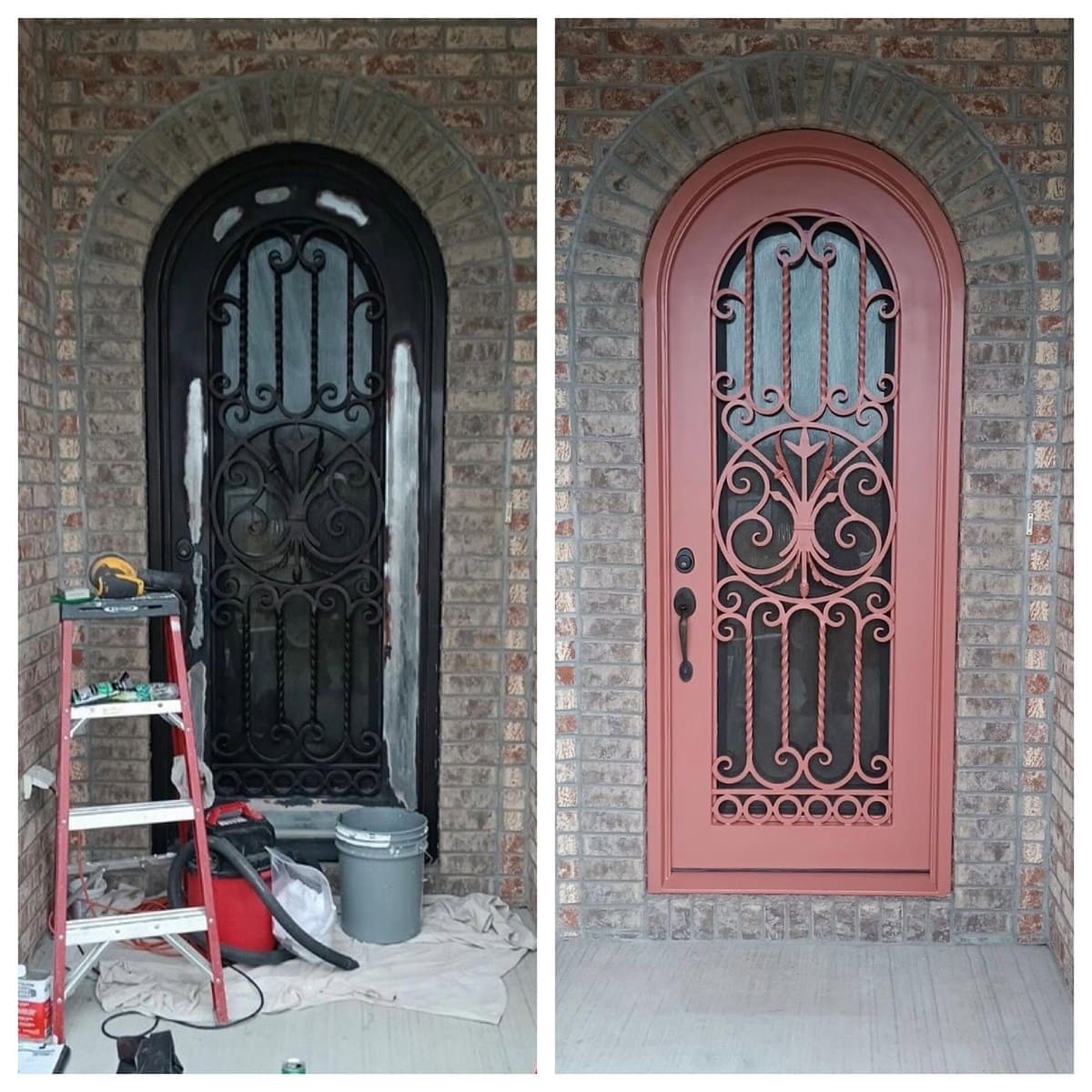
Your front door may occupy a small part of your home’s exterior, but its color can make a lasting impression. Picture a soft blue door against white siding or a rich burgundy entrance framed by traditional brick. Each combination creates a different feeling before anyone steps inside.
Understanding front door paint psychology can help you choose a welcoming color that pops. Some shades feel cheerful and expressive, while others bring a quieter sense of warmth. Finding the right balance starts with considering your home’s character and the impression you’d like to create.
What Does Your Front Door Color Say About Your Home?
Color influences how people experience a space, and your front entrance is no exception. Certain shades carry familiar associations that can make a home appear welcoming, elegant, or relaxed.
A bright yellow door often feels playful, while a deep green entrance suggests a more traditional style. Those impressions can change depending on the surrounding architecture and how much contrast the color creates.
Your personal preferences matter more than any universal interpretation. Consider which colors make you feel at home and how they might complement the exterior you’ve already created.
Warm Front Door Colors That Feel Inviting
Warm colors naturally attract attention, making them appealing choices for homeowners who want their entrance to stand out. Their welcoming character can range from cheerful and expressive to rich and understated.
Red for a Timeless, Welcoming Entrance
Red has a long history as a front door color, particularly on traditional homes. Its association with warmth and hospitality gives it an inviting personality, while its intensity draws attention toward the entrance.
A classic red looks beautiful against white siding, especially when darker hardware provides contrast. If your exterior features natural brick, consider a deeper cranberry or wine-inspired shade that complements the masonry.
Pay attention to undertones when comparing samples. Orange-based reds often feel brighter, while cooler reds create a richer appearance.
Yellow for a Cheerful First Impression
Yellow brings a sunny quality to an entrance, making it a charming choice for cottages and contemporary homes. A soft golden yellow can warm up a pale exterior without feeling overly bright. Mustard yellow offers a more subdued alternative, particularly against dark gray siding.
If you love yellow but worry about its intensity, compare muted shades before choosing a more saturated option. Even a gentle yellow can attract attention when the surrounding exterior features neutral tones.
Orange for an Unexpected Touch of Personality
Orange may seem adventurous for a front door, but the right shade can feel surprisingly welcoming.
Terracotta and burnt orange offer warmth that pairs beautifully with cream-colored siding or earthy exterior finishes. These shades create a softer impression than bright citrus orange, making them easier to incorporate into traditional architecture.
Look for orange shades that complement the undertones already present in your exterior. A slightly muted finish can add personality without competing with nearby brickwork.
Cool Front Door Colors That Create a Relaxed Atmosphere
Cooler colors often bring a calmer presence to an entrance. They can still make a statement, particularly when you choose a shade that contrasts with the surrounding siding.
Blue for Coastal Charm and Classic Style
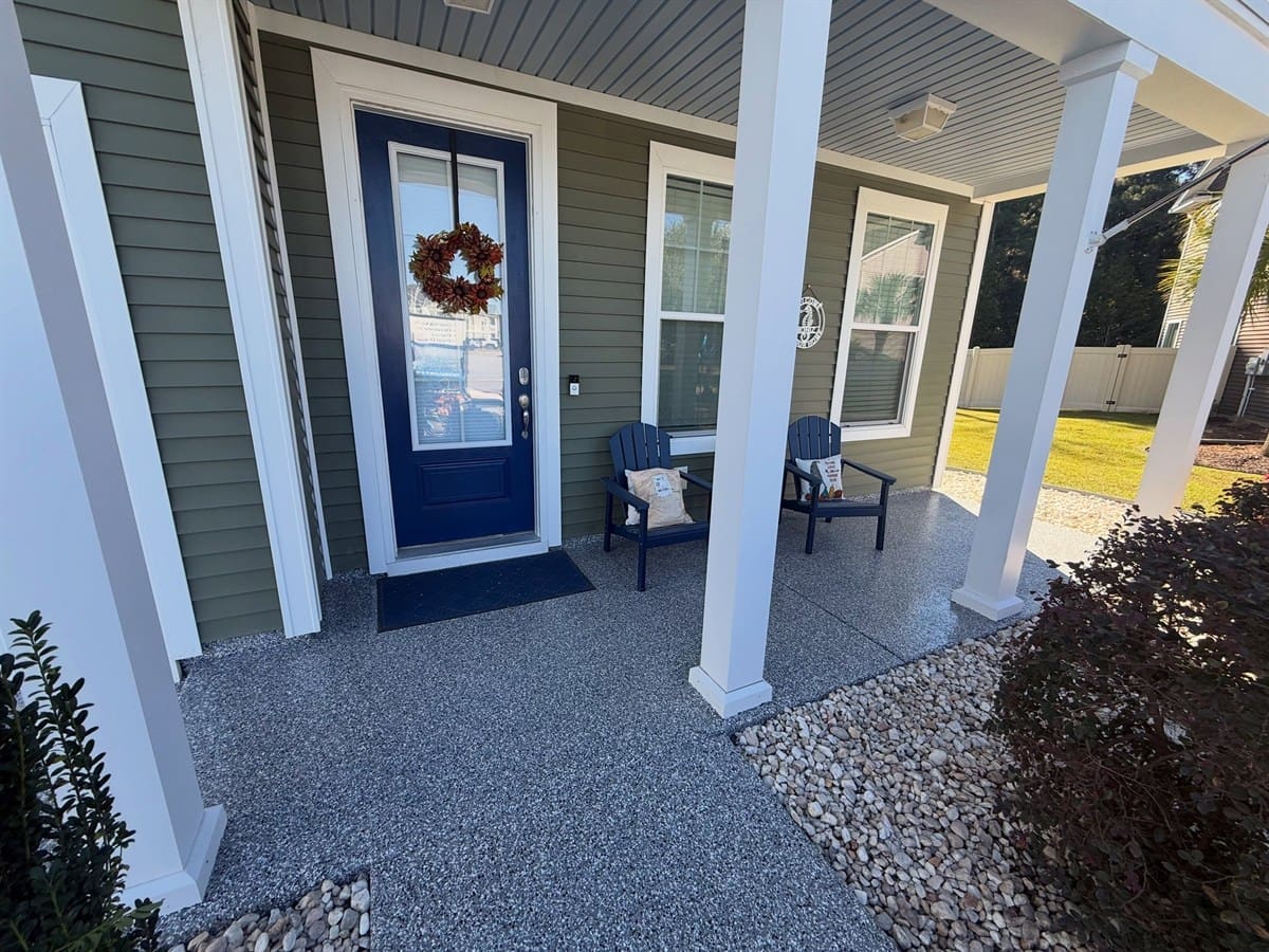
Blue offers plenty of flexibility because its personality changes with the shade. Powder blue feels light and breezy, making it a natural fit for coastal-inspired homes. Navy creates a more traditional appearance, especially when paired with white trim.
Around Myrtle Beach and Charleston, blue can complement the relaxed character of coastal architecture without making your home feel overly themed.
If your siding has warm undertones, compare blue samples carefully. Some shades contain subtle green influences that may blend more naturally with your exterior.
Green for a Connection to Nature
Green often feels welcoming because it’s associated with the outdoors. It can make an entrance feel peaceful while complementing the landscaping around your home.
Sage green creates a gentle appearance against warm white siding, while forest green offers a richer contrast.
For homes with brick exteriors, olive green can bring out the natural warmth of the masonry. Consider how nearby plants frame the entrance, since similar shades of green may soften the contrast.
Neutral Front Door Colors With Lasting Appeal
You don’t need a bright color to give your front entrance personality. Neutrals can create an equally memorable impression when you use contrast thoughtfully.
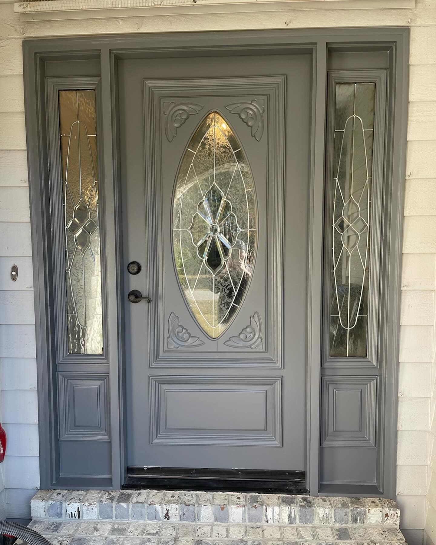
Black remains a popular choice because it gives the doorway a defined appearance. It works beautifully with white exteriors and can complement traditional architectural details.
Charcoal offers a softer alternative if pure black feels too dramatic. For a warmer look, consider a deep chocolate brown that complements natural stone or creamy siding. A neutral door can also make decorative hardware more noticeable. Brass finishes, for example, bring warmth to darker paint colors without competing with the exterior.
How To Match Your Front Door Color to Your Exterior
Before settling on a shade, take a good look at the colors your home already has. Your siding provides the largest visual backdrop, but permanent materials such as brick or stone can influence which colors feel harmonious.
If your exterior features warm beige siding, a muted green or deep red may complement its undertones. Cooler gray siding can pair beautifully with navy or a carefully chosen yellow.
Contrast matters, too. A dark door against a light exterior naturally draws the eye toward the entrance, while similar colors create a quieter appearance.
Quick Tip: Compare Colors in Natural Light
Paint samples can look different outdoors than they do inside a store. Before making your final choice:
- Place large samples near your front entrance.
- Check the colors during morning and afternoon light.
- Step back toward the street to compare the overall appearance.
Notice how the color looks beside your trim rather than judging it on its own. Your favorite shade should feel comfortable within the existing exterior palette.
Why Paint Finish Matters as Much as Color
Once you’ve chosen a color, consider how the paint finish will affect its appearance.
Satin finishes provide a subtle sheen that suits many front door styles. Semi-gloss creates a brighter appearance and can highlight raised panels or decorative molding.
The condition of your door also matters. A higher sheen can make surface imperfections more noticeable, particularly when direct sunlight reaches the entrance.
South Carolina’s warm, humid climate adds another consideration. Choose exterior paint that suits your door’s material and exposure conditions. Proper cleaning and surface preparation help the coating adhere and maintain an attractive finish.
Make Your Front Door Feel Like a Natural Part of Your Home
The most welcoming front doors have personality without feeling disconnected from the rest of the exterior. Your favorite color might be a cheerful red or a quiet sage green, and either can look beautiful with the right surroundings.
Understanding front door paint psychology and choosing welcoming colors that pop can help you approach the decision with greater confidence. Take time to compare your options in natural light and consider how the final color will look from the street.
At Paint Rx, we help homeowners throughout Myrtle Beach and Charleston refresh their exteriors with careful painting and dependable service. Ready to give your entrance a fresh look? Contact our South Carolina painting company to discuss your next painting project.