6 Home Office Paint Colors That Boost Productivity
Color shapes how you think, focus, and perform each day. When homeowners search for home office paint colors that boost productivity, they want practical guidance to create a workspace that truly supports their goals.
The right paint color improves concentration, stabilizes energy, and reduces visual stress. Since many professionals now spend hours working from home, the office environment plays a major role in daily output. Thoughtful color selection turns an ordinary room into a high-functioning workspace.
Below are six proven color families that consistently improve productivity and focus.
Soft Blue for Focus and Mental Clarity
Blue fosters calm focus and steady thought, facilitating a smooth flow that boosts concentration. Many professionals prefer blue for tasks involving detail, analysis, or problem-solving, as it helps guide the mind through complex challenges. Light blue shades make small offices feel more open and evenly reflect natural light, improving the overall flow and sense of space.
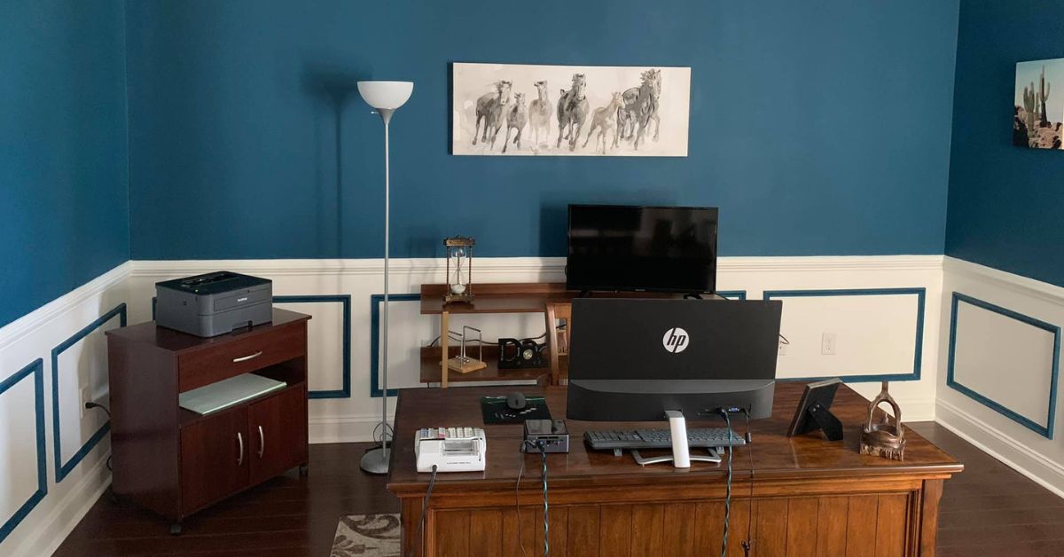
Medium blues add depth without overwhelming the space, allowing for a smooth visual transition. Navy introduces structure and sophistication while maintaining a composed atmosphere, fostering an environment conducive to continuous, uninterrupted work.
Blue also works well for video calls because it presents cleanly on camera, ensuring clear communication. If you want a reliable productivity color, blue consistently delivers strong results, supporting a steady, productive workflow.
Muted Green for Balance and Reduced Eye Strain
Green hues are known for supporting a sense of balance and providing visual comfort, creating a calming environment that connects you with nature. This connection helps your brain stay relaxed yet alert, fostering focus and clarity.
For example, incorporating shades like sage, olive, and soft eucalyptus can reduce eye strain and fatigue, especially during extended screen time. These colors work beautifully with natural materials such as wood furniture and indoor plants like ferns or pothos, which further enhance the soothing atmosphere and promote a sense of well-being.
Professionals managing high workloads often prefer green tones because they help sustain steady energy levels throughout the day. Green encourages concentration without triggering overstimulation or anxiety, making it an ideal choice for workspaces that require sustained focus and a peaceful ambiance.
Warm Neutrals for Flexible Performance
Warm neutrals create a clean and versatile backdrop. They work well if you want a timeless look that adapts as your needs change.
Popular options include:
- Greige with warm undertones
- Soft taupe
- Creamy off-white
- Light beige
These shades reflect light and prevent smaller offices from feeling cramped. Warm neutrals also support a distraction-free environment, which benefits professionals who prefer simplicity.
If you plan to repurpose the room in the future, neutral tones offer long-term flexibility.
Sophisticated Gray for Structured Productivity
Warm gray tones, which contain subtle brown or beige undertones, feel inviting and balanced, creating a cozy atmosphere. Cool gray shades, with hints of blue or green undertones, appear modern and crisp, perfect for contemporary spaces.
The key lies in selecting the right undertone that complements your lighting—warm lighting enhances warm grays, making them appear even more inviting. In contrast, cool lighting accentuates the crispness of cool grays, emphasizing their sleek, modern look.
Test gray paint samples throughout the day to observe how they change with natural light. A well-chosen gray creates a focused, organized atmosphere that encourages steady output.
When evaluating home office paint colors that boost productivity, gray remains one of the most adaptable and reliable choices.
Soft Yellow for Creative Energy
Yellow is often associated with optimism and can stimulate creative thinking. It can be particularly beneficial for writers, designers, marketers, and entrepreneurs who depend on generating new ideas. When choosing yellow for interiors, opt for muted golden or buttery tones rather than bright primary shades, as overly bold yellows may cause distraction and eye strain.
A softer yellow introduces warmth and a sense of momentum without overwhelming the space. We also recommend considering a yellow accent wall if you want a subtle burst of energy in a room without committing to a full yellow decor.
Deep Teal for Confident Focus
Teal blends the calming qualities of blue with the balanced freshness of green, creating a hue that evokes tranquility and harmony. It offers depth and personality to any space while still supporting focus and concentration.
Darker teal shades help create a grounded, confident work environment, framing a desk area beautifully and adding dimension to the room. Teal works particularly well in offices with ample natural light, maintaining its richness without feeling heavy or overpowering.
If you’re seeking a color that feels both bold and controlled, teal provides that perfect balance, integrating vibrancy with subtle sophistication.
How Lighting Changes Everything
Lighting affects how paint looks on your walls, causing even the ideal shade to change from morning to evening. South-facing rooms receive warmer light, highlighting cooler tones and making them stand out. Conversely, north-facing rooms feel cooler, so selecting warmer shades helps avoid a dull or flat appearance.
Before committing to a color:
- Apply large test samples on at least two walls
- Observe the color in morning and evening light
- Evaluate under your regular office lighting
- Compare against trim and flooring
Testing prevents costly repainting and ensures the color supports productivity at all hours.
Matching Color to Your Work Style
Choosing the ideal paint color depends heavily on how you work and your daily routines. For instance, if your tasks involve detailed financial analysis or bookkeeping, calming shades like soft blues or gentle greens can help promote concentration and precision, creating a tranquil environment conducive to focus.
For those who frequently meet with clients, opting for a backdrop of structured neutrals or muted grays can convey professionalism and stability, making a positive impression.
Creative professionals might find subtle energizing tones such as muted yellow or teal invigorating, providing a boost of inspiration without overwhelming the senses.
Avoiding Common Home Office Color Mistakes
Many homeowners rush the selection process. That often leads to choices that look good at first but create frustration over time.
To protect your productivity and investment, avoid these common mistakes:
- Choosing very dark colors in small rooms without adequate lighting
- Selecting ultra-bright shades that cause glare during screen time
- Ignoring undertones that clash with flooring or trim
- Skipping paint samples and relying only on small swatches
- Following short-term trends instead of long-term functionality
Intentional selection ensures long-term satisfaction and stronger daily performance. A well-planned color choice supports focus every single day, not just the first week after painting.
Professional Results Elevate the Entire Space
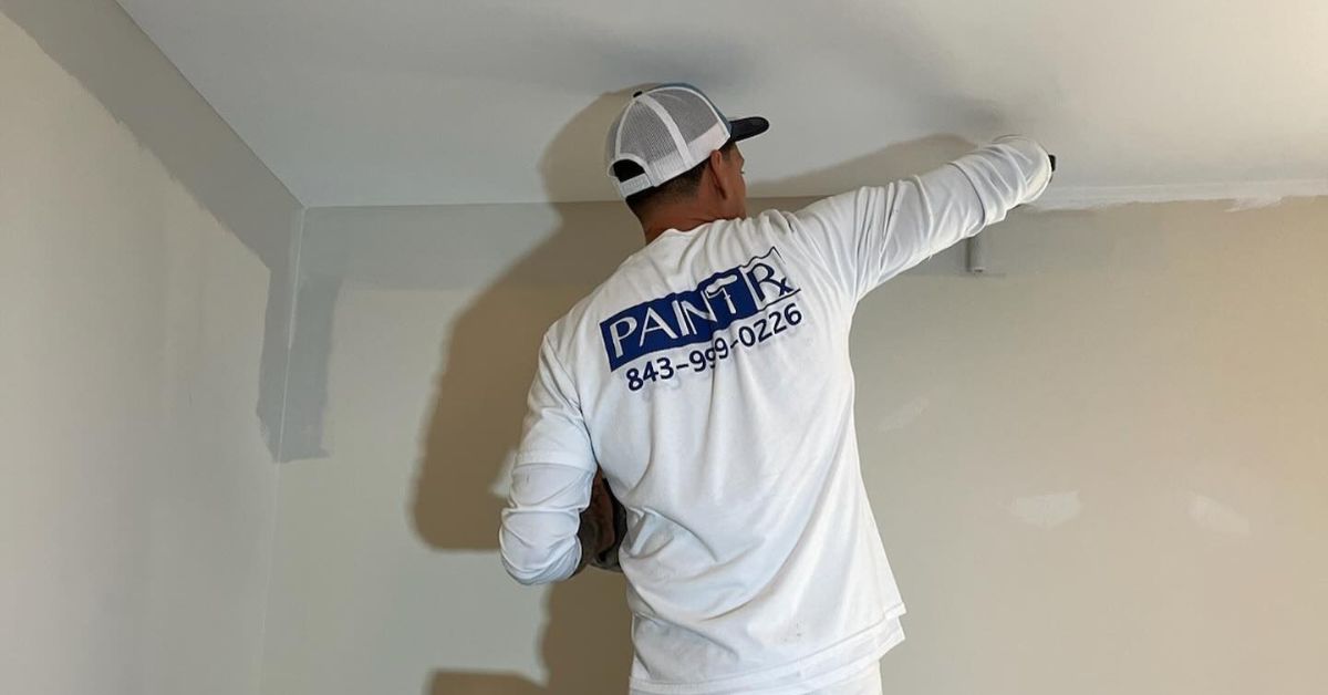
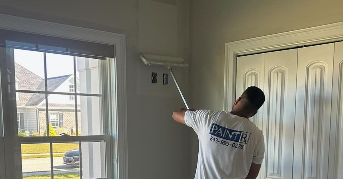
Even the best color cannot perform well without proper preparation and application. Smooth finishes, sharp lines, and even coverage create a polished and motivating workspace.
When you invest in professional interior house painting, you protect your time and ensure consistent results. Skilled painters handle surface preparation, repair imperfections, and apply paint with precision.
If you want a home office that genuinely supports productivity, start with thoughtful color and expert craftsmanship. Contact Paint Rx to schedule a consultation and create a workspace designed to help you perform at your best.