6 Exterior Accent Colors That Boost Your Home’s Curb Appeal
Have you ever noticed how a brightly colored front door or a fresh coat of paint on the shutters can completely change a house’s appearance? It might seem like a small detail, but these accent colors are what give your home its personality. A well-chosen splash of color can draw the eye, show off your home’s best features, and make the whole place feel more welcoming before anyone even rings the bell.
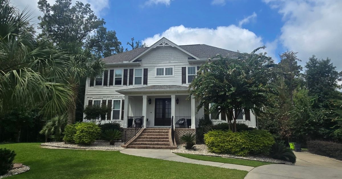
Whether you’re in a classic Charleston single house or a modern bungalow in Myrtle Beach, choosing the right exterior accent colors can boost your home’s curb appeal and transform its entire look.
But picking the perfect shade isn’t just about grabbing a color you like from the paint store. It’s important to consider your home’s main color, your landscaping, and even the unique coastal light we get here in South Carolina. Let’s walk through how to choose colors that create a balanced, beautiful contrast.
Why Contrast Matters for Curb Appeal
Your home’s exterior is a composition of different elements: siding, trim, roof, and landscaping. Without contrast, these elements blend, making the house look flat or uninspired. Accent colors break up the visual monotony and create depth.
Think of your front door as the focal point. It anchors the entryway and signals where to look. When you use a bold accent color here, you guide the eye naturally to the entrance. Shutters, window boxes, and trim serve as supporting players, framing windows and adding rhythm to the facade.
The Role of Light in Coastal Areas
In South Carolina, the sun hits differently. Bright, direct sunlight can wash out subtle colors, making them appear almost white, while the same color might appear much darker in the shade on a porch.
When choosing exterior accent colors that boost your home’s curb appeal, make sure to test your samples at different times of the day. A color that looks just right at noon might fade away by dusk.
Classic Blue Hues for Coastal Charm
Blue is a perennial favorite in coastal regions like Myrtle Beach and Charleston. It reflects the ocean and sky, creating a sense of calm and continuity with the environment.
Navy Blue
Navy is a safe yet sophisticated choice. It works exceptionally well with white, cream, or light gray siding. A navy blue door adds a touch of nautical elegance without feeling too thematic. It commands attention but remains dignified.
Haint Blue
You cannot talk about Charleston porches without mentioning “haint blue.” This pale, greenish-blue shade is traditional for porch ceilings, intended to ward off spirits (or “haints”) and insects. Today, it serves as a refreshing accent color for shutters or doors on historic and cottage-style homes. It pairs beautifully with warm white or pastel siding.
Warm Tones to Create a Welcoming Vibe
If you want your home to feel energetic and warm, look toward the red and yellow families. These colors recede visually, making a house feel more approachable.
Barn Red or Burgundy
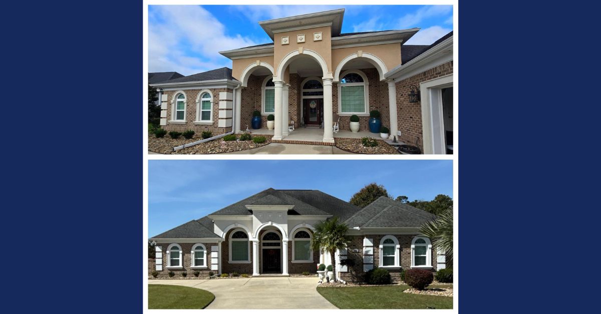
Red is a classic choice for a reason. It symbolizes welcome and warmth. A deep red door looks stunning against beige, tan, or gray siding. It provides a strong focal point that is both traditional and bold. For brick homes, a darker burgundy can complement the masonry without clashing.
Buttery Yellow
Yellow evokes happiness and sunshine. A soft, buttery yellow door can brighten up a gray or blue house. It adds a cheerful touch without being overwhelming. This color works particularly well on cottages or bungalows where you want to emphasize charm.
Earth Tones for a Natural Look
For homeowners who prefer a more understated aesthetic, earth tones can boost curb appeal while blending seamlessly with the landscape.
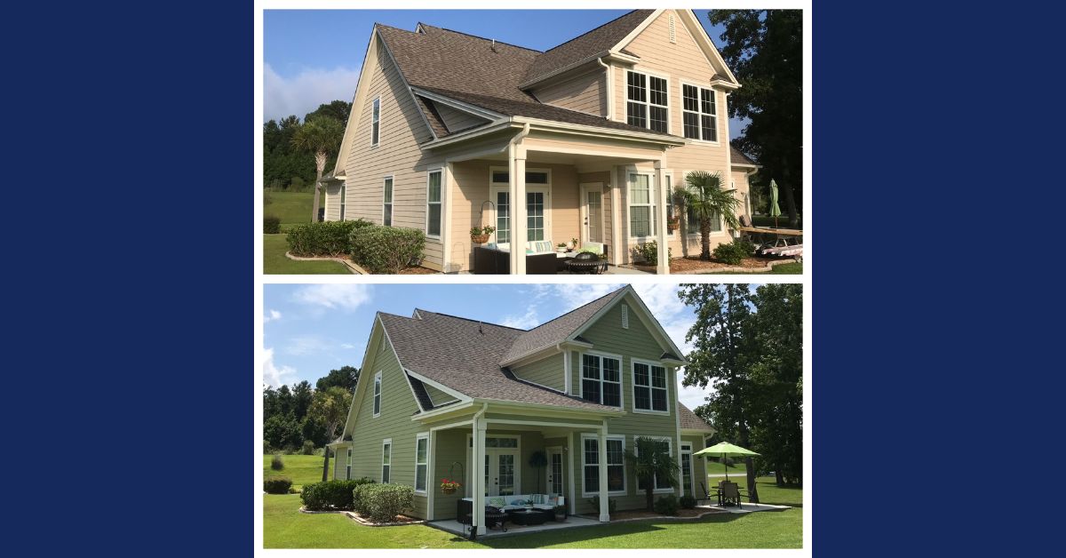
Sage Green
Sage green is a versatile neutral that bridges the gap between gray and green. It looks fantastic on homes with stone or wood elements. It provides a soft contrast to cream or white siding and echoes the greenery of your garden.
Charcoal or Black
Black is the ultimate neutral. High-gloss black shutters or a front door create instant sophistication. This works well with almost any siding color, from white to brick to deep cedar. It acts like mascara for your home, defining features and making everything look sharper.
How to Coordinate Accents with Fixed Elements
Before you head to the paint store, look at the parts of your home you cannot easily change. Your roof, brickwork, and stone foundation all have undertones that your accent colors must respect.
- Warm Roof Tones (Brown, Rusty Red): Stick to warm accents like red, cream, or warm beige. Avoid cool blues that might clash.
- Cool Roof Tones (Black, Gray, Slate): You have more freedom here. Cool blues, greens, and crisp whites look excellent, but bold reds can also work well as a high-contrast option.
- Brick and Stone: Identify the flecks of color in your masonry. If your brick has dark specks, a charcoal door will tie everything together. If your stone has copper tones, a warm wood stain or rusty orange accent could look incredible.
Testing Your Colors Before Committing
You should never rely solely on a small paper swatch. Exterior lighting dramatically affects how paint appears compared to indoor lighting.
- Buy Samples: Purchase pint-sized samples of your top three choices.
- Paint Large Swatches: Paint a large poster board or a section of the house that you can easily paint over.
- Observe Over Time: Look at the color in the morning, afternoon, and evening. See how it looks when it’s cloudy versus sunny.
- Check from the Curb: Walk out to the street. Does the color stand out enough? Does it look harmonious with the rest of the house?
Keeping Your Accents Fresh
Even the most beautiful color loses its impact when the paint is peeling or faded. South Carolina’s humidity and salt air can be tough on exterior surfaces. Regular maintenance involves cleaning your door and shutters to remove salt buildup and checking for signs of wear. A fresh coat of paint on these small areas is an easy weekend project that maintains your home’s value.
Making the Right Choice for Your Home
Selecting the correct accent colors requires balancing personal taste with architectural considerations. You want a home that reflects who you are but also fits well within your neighborhood. Whether you opt for a daring red or a serene blue, the right accents act as the finishing touch that pulls your entire exterior design together.
If you are unsure which palette suits your home best, or if your exterior surfaces require more extensive preparation due to weathering, a professional exterior house painter can provide the expertise needed to achieve a lasting, flawless finish.
For more tips on choosing the perfect colors or to schedule a consultation with our expert team, contact us today and take the first step toward transforming your home’s exterior!