10 Window Trim Colors That Enhance Your Home’s Appearance
Curb appeal starts with proportion, contrast, and color placement. Siding covers the largest surface area, yet trim defines edges and frames every window with intention. When trim works with your siding and roof, the home feels balanced and well planned.
Homeowners looking to choose window trim colors that improve their home’s aesthetic should consider undertones, architectural style, and nearby materials before selecting a shade. Trim influences how people perceive your home from the street. High contrast emphasizes structure, while lower contrast fosters harmony.
The following 10 options provide versatile choices suitable for a range of styles, from traditional to modern.
Classic White for Crisp Definition
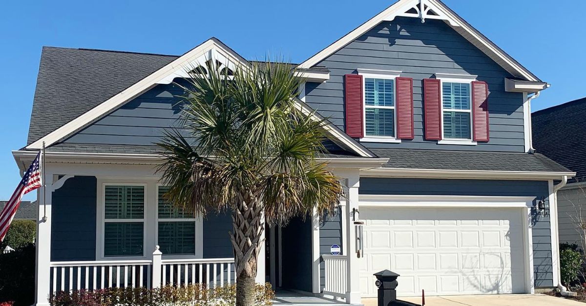
White trim creates a sharp separation against darker siding. Navy, charcoal, forest green, and brick exteriors benefit from its clean outline. This contrast emphasizes window placement and decorative molding.
Colonial and coastal homes rely on white trims to reinforce symmetry. Cooler whites pair well with gray-based siding, while warmer whites complement beige or cream palettes. In bright sunlight, white maintains clarity and keeps the exterior feeling structured.
Soft Off-White for Subtle Warmth
Off-white provides contrast without harsh brightness. It pairs well with greige, sage, tan, and muted blue siding. This shade softens transitions between materials while still defining the window frame.
Stucco and coastal homes benefit from warmer whites that blend naturally with sandy surroundings. Off-white also disguises light surface dust better than bright white, which supports long-term curb appeal in humid climates.
Charcoal Gray for Modern Structure
Charcoal trim provides a striking border that adds a touch of elegance. The light gray, white, and pale blue siding beautifully complement this shade, creating a pleasing balance. The depth of the trim brings a sense of solidity without feeling heavy or overbearing.
Modern and transitional homes benefit from charcoal, which sharpens clean lines and geometric forms. When paired with black window frames or dark metal accents, charcoal creates layered dimension across the elevation.
Jet Black for High-Contrast Impact
Black trim commands attention and outlines windows with precision. White or light gray siding produces the strongest visual separation. Farmhouse and contemporary homes support this dramatic pairing particularly well.
Balance plays an important role with black trim. Coordinating shutters or a front door in the same tone creates continuity. Without repetition, the contrast can feel abrupt.
Warm Beige for Earth-Toned Harmony
Beige trim blends naturally with brick, stone, and warm-toned siding. It defines windows gently rather than creating bold separation. Traditional and Mediterranean homes frequently benefit from this cohesive look.
Homes with brown roofing or mature landscaping gain continuity from beige trim. Instead of competing with masonry elements, this shade supports them and keeps the exterior grounded.
Deep Navy for Refined Character
Navy trim introduces depth without overwhelming lighter siding. White, cream, and pale gray exteriors pair well with this classic tone. The result feels structured yet inviting.
Coastal homes frequently incorporate navy to reinforce architectural lines while maintaining personality. Brass fixtures, black hardware, or matching shutters strengthen the overall palette.
Forest Green for Natural Balance
The forest green trim beautifully ties the home to its surroundings, creating a warm, inviting feel. The beige, cream, and brick exteriors complement this rich tone perfectly, adding depth while keeping a natural harmony.
Craftsman and cottage-style homes especially shine with green trim, as it highlights wood accents and architectural details without overwhelming the overall look.
Slate Blue for Soft Dimension
Slate blue introduces subtle color while preserving restraint. It complements white, taupe, and light gray siding with quiet contrast. This shade works well for homeowners who want personality without dramatic separation.
Traditional and coastal designs both accommodate slate blue. The muted tone is defined while maintaining a calm, cohesive appearance.
Cream for Timeless Appeal
Cream trim bridges the gap between white and beige. It brightens darker siding while adding warmth to cooler palettes. Historic homes often use cream to highlight molding and decorative trim.
This shade supports architectural character without harsh contrast. It also coordinates easily with brown roofing and natural stone.
Greige for Contemporary Balance
Greige beautifully blends gray and beige, creating a warm and adaptable neutral that suits many styles. It complements colors like white, blue, charcoal, and muted green, sitting with ease. Transitional homes especially benefit from greige, as it provides structure without overwhelming contrast.
This charming shade aligns perfectly with current design trends while offering great versatility. Greige trim gently highlights window placement, adding subtle elegance without stealing the show.
Understanding Undertones Before Choosing Trim
Undertones influence how trim interacts with siding. Warm siding with yellow or red undertones pairs best with trim that carries similar warmth. Cool siding with blue or gray undertones performs better with trim in the same temperature range.
Testing paint samples on multiple sides of the home reveals how sunlight shifts color throughout the day. Morning light, afternoon glare, and shaded areas all affect perception. Careful observation prevents mismatched tones and uneven contrast.
If you want window trim colors that enhance your home’s appearance, undertone alignment should guide every decision.
How to Select the Right Trim Color
Trim should connect siding, roofing, and fixed materials into one cohesive design. Strategic evaluation prevents imbalance and repainting.
Start by comparing undertones between siding and trim. Next, evaluate the roof shingle color since it anchors the upper portion of the home. Brick, stone, and concrete elements require attention because they remain permanent features.
Use this checklist during selection:
- Compare siding and trim undertones
- Coordinate trim with roof shingles
- Pull complementary tones from brick or stone
- Test larger samples in natural daylight
- Align trim with shutters and door color
Each step strengthens cohesion and visual balance.
Common Trim Color Mistakes
Rushed decisions weaken exterior design. Many homeowners treat trim as an afterthought, which reduces definition and proportion.
Matching trim exactly to siding removes contrast and flattens the façade. Ignoring roof undertones can create visual separation between the home’s top and bottom. Small sample chips also fail to show how color behaves across a full window frame.
Avoid these common mistakes:
- Matching trim exactly to siding
- Overlooking roof temperature
- Skipping large sample testing
- Choosing bold trends without architectural alignment
- Using flat finishes on exterior trim
Thoughtful planning protects curb appeal and supports long-term durability.
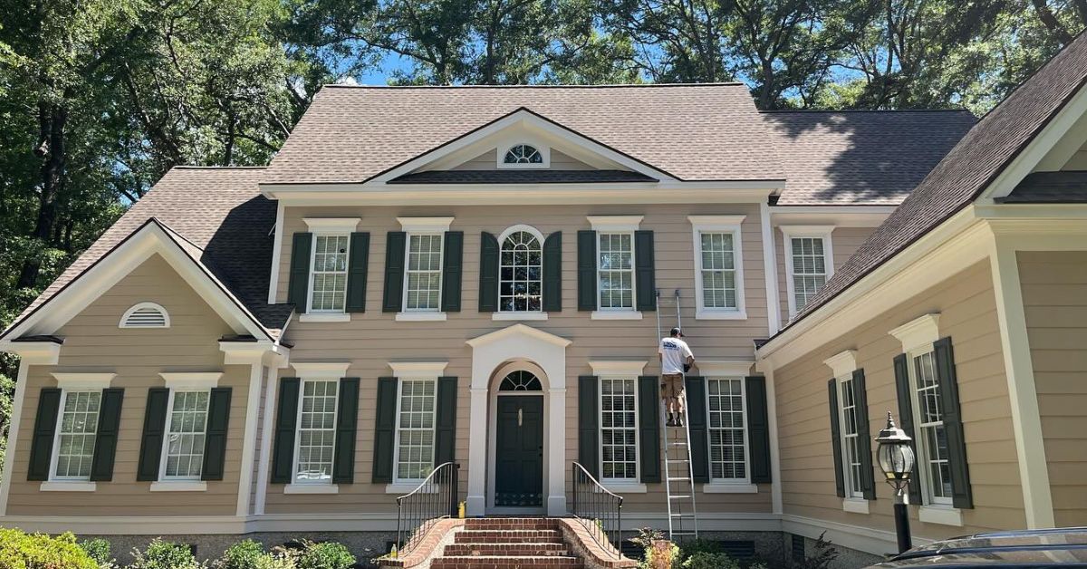
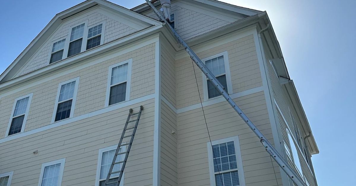
Professional Trim Painting for Lasting Results
Precision defines successful trim painting. Clean lines, proper surface preparation, and durable coatings separate average work from polished results. Sanding, caulking, and priming create a stable surface for smooth application.
Homeowners who want sharp detail and long-lasting performance benefit from working with experienced exterior house painting contractors who understand climate exposure, material conditions, and proper coating systems. Schedule a consultation to evaluate your trim color options and create a cohesive exterior plan.
While trim may cover less surface area than siding, it truly makes a big first impression. By carefully choosing the right colors and applying them skillfully, you can highlight your home’s structure, create a sense of balance, and boost its lasting curb appeal. It’s all about the thoughtful details that make your home inviting and beautifully put together.